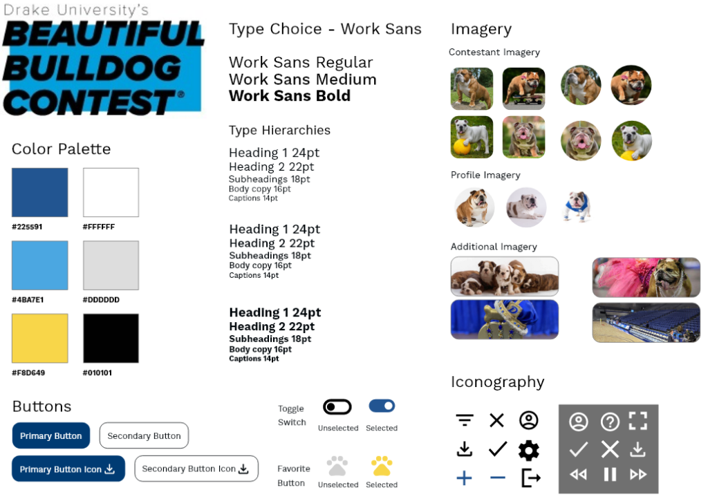
Style Tile
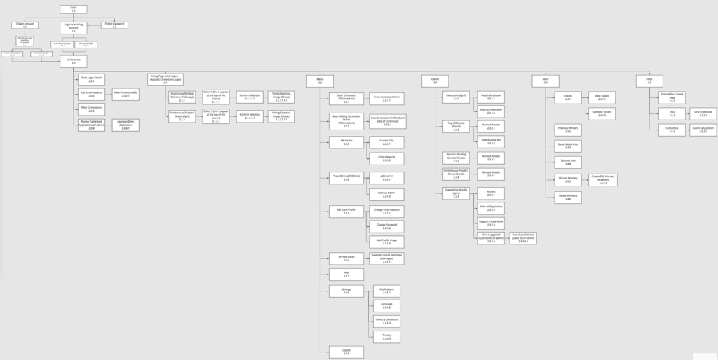
Sitemap
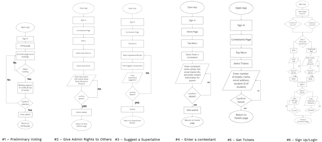
User Flows
Wireframes
User Testing
Our group sought to target members of a single demographic: students. All members tested in our user testing process were aware of the contest, had attended, or aimed to attend at some point during their time at Drake.
100% of our users were able to complete the first four tasks with little to no problem. However, when we asked our users to view the results, three out of the five users struggled to complete this task. The assumption was that the “Events” page, although properly titled, was not an obvious place to place the results of the event. One user promptly mentioned that “Events” was a “weird title for something that encompases so much,” and promptly noted thereafter that alternative copy would better convey our point. Another noted that it was odd that the events tab was in the middle of the page, rather than at the top of the page, and looked disguised like an article rather than an actual section. However, all users were able to properly complete this task with no assistance, many complained about the embarrassment of struggling to find something so obvious, however.
Another important callout came from one user who was tasked with locating and finding tickets. Although they were able to locate the page properly, the user suggested having a popup banner on the home page, or a banner on the profile page, which would target the already existing pool of potentially interested members for the event. This would draw attention to a key feature of the app while increasing awareness of the event, and encouraging others to attend, which would be a key benefit.
Although I assumed users would struggle to click pawprints when voting and would instead be confused as to where to click, no users tested struggled with that concept and instead were able to successfully vote, which caught me off guard! All users noted that they enjoyed how similar the color scheme on the app resembled the Drake branding patterns, and enjoyed the fact it could be shared instantly to social media. One user even noted that the entire app screen looked like something that could be shared to Facebook, which was interesting, given that that user had very little knowledge of social experience.
Overall, our team made some minor copy changes and properly edited the placement of the results page in order to adequately meet the preferences of our users, therefore making an enjoyable user experience. However, we discarded the concept of a user pop-up banner, primarily due to clutter.